Kemp House, City Road, London EC1V 2NX
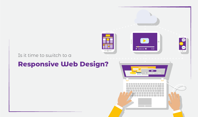
Is it time to switch to a Responsive Web Design?
Have you ever encountered the shrunken version of a desktop website on a mobile device?
If yes then you must know how irritating it looks.
The industry of web development is growing with the advancement in technology. More and more websites are turning toward responsive web designs.
Why?
Because users bounce back if they can’t easily browse your website. According to the stats, 40% of the users go to the competitor’s website after getting a bad user experience.
A website should be user-friendly no matter from which device it is accessed. To solve this matter, responsive web design comes into action.
But before explaining the importance of responsive web design is, let’s see first what responsive web design is.
Responsive Web Design – what is it Exactly?
Websites are being accessed from several devices such as smartphones, tablets, desktops, laptops, etc. all having different screen sizes. A responsive website adjusts itself according to the respective screen size.
Technically, a responsive web design detects the type of device and responds to the alteration in the browser width by fitting the design elements into the available screen space. The content of the website also gets arranged optimally for the screen size.
Non-responsive websites are difficult to browse on mobile devices. As these websites are designed for desktop, that is why fitting everything in a small screen of mobile devices looks like a mess.
On the other hand, responsive websites arrange their design and elements according to the screen size. With a responsive website, you don’t need to scroll the screen horizontally or zoom in the screen to read the content.
Every element is readable and clickable in responsive web design. Responsive web design aims to make sure that all the elements of your website work perfectly on every device.
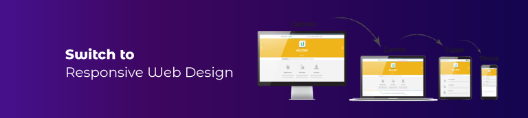
Why Do You Require to Switch to Responsive Web Design?
To stay ahead in the competitive world, you must not limit your website to desktop. Get a responsive website so that your website becomes compatible with every device.
With responsive web design, you can enjoy the following benefits:
Low Bounce Rate:
The bounce rate of your website matters a lot in SEO. When visitors do not find a website appealing or engaging they bounce back without interacting with the site. Responsive web designs are engaging enough to entertain web visitors. Websites with responsive design adapt according to the screen size of the operating device. Thus, the user easily surfs through the website without any disturbance. This increases user engagement and lowers the bounce rate.
Fast Loading Speed:
Responsive websites load faster on all screen sizes. Whereas, desktop websites take a lot of time to load on mobile devices. According to Google, 53% of visitors abandon a website if it takes more than 3 seconds to load. Responsive web design enables websites to adjust according to the screen size of the respective device. Fast loading speed also enhances user engagement and visit session.
Boosted Web Traffic:
If you have designed your website beyond the limitation of device category and size, your website is ready to conquer the digital market. With the only desktop version of the website, people who only use the laptop will visit your site.
According to the stats of 2019, 47% of people already use mobile devices to browse the internet.
Mobile devices are used by more than half of the people nowadays. Having a responsive website can increase your chances to get better traffic which leads to an increased conversion rate.
Compatible Website:
It is great to have a website that is accessible from smartphones and tablets as well as laptops and desktop. Limiting your website to one or two variations of screens can bring too much loss to your company. A responsive website is compatible with every screen size of every device.
Consistent User-Experience:
A good user experience increases the visit session and conversion rate of a website. While a bad user experience increases the bounce rate and lowers the conversions of your website.
A website should be fast, appealing, user-friendly, and responsive otherwise the visitor will switch to the competitor’s site. Responsive web design let user engage with the website and provide an excellent user experience.
The more user engagement boosts up the probability to drive sales.
Improves SEO:
Web loading speed, mobile-friendliness, and user-experience matter a lot in web ranking. Google ranking system picks responsive websites for better ranking over websites that are not responsive to multiple devices.
A responsive web design drives more traffic as it is more likely to appear in the top results of SERPs. Also, great traffic comes with great conversions.
Reduced Maintenance Cost:
The maintenance of a responsive website is cost-effective as compared to specified versions of mobile and desktop websites. A responsive web design adjusts across various screen sizes. Whereas specified version websites need to be updated according to the requirements of different devices.
With a responsive website, you only have to update, optimize, and endorse one website which reduces time and resources.
Bonus Point:
Two other types of websites get confused with responsive websites; mobile-friendly websites and adaptive websites.
A mobile-friendly website is designed to work on specific mobile devices and have static web content that cannot be changed.
Whereas, an adaptive website has multiple layout sizes suitable for different devices. These layout sizes are fixed and each layout fits the appropriate device screen.
Compared to these, responsive websites adjust according to the screen sizes of various devices.
Conclusion:
Responsive web design is the ultimate way for your website to get better ranking and traffic. If your website is still not responsive, then it’s time to update otherwise you will lose web visibility among search engines.
Web responsiveness is not only required to get better ranking but it also increases user experience. Drive more and more audiences with a responsive website and boost your brand reputation.
If you are looking for responsive web design services, work with SolutionSurface and let the experts handle your project. We deliver high-tech websites to provide great user experience worldwide.
Related Posts
The 6 Most Common Web Design Mistakes
Brands mostly rely on their websites because a website is...
Read More
Top 5 Bad Web Design Trends You Need to Avoid
Every brand wants its website to look great. Despite the...
Read More
How Do You Pick The Best Web Design Agency?
Websites represent your brand in the digital world. Technology is...
Read MoreContact Us
Leave a Comment
Your email address will not be published. Required fields are marked *