Kemp House, City Road, London EC1V 2NX


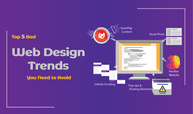
Top 5 Bad Web Design Trends You Need to Avoid
Every brand wants its website to look great.
Despite the functionality and performance of a website, the thing that draws user attention is web design.
People attract more toward appealing web designs. A website with good infrastructure lets visitors explore it by directing them throughout the navigation. Websites with good designs lower the bounce rate and increase the session rate.
Every year brings new trends in web design and development.
Web designs that can not engage visitors are of no benefit.
If you observe that your website is not engaging enough audience, then it’s time to update your web design.
To avoid an increased bounce rate, here are some outdated trends you need to unfollow.
Web Designing Trends You Need to Avoid for Better Conversion:
A website contains different visual elements, each having the same purpose i.e. to increase the conversion. Most of the websites contain components that decrease user experience.
Users appreciate a website that directs them to navigate it, not a website that forces them to view the content of the website.
Here are some awful web designs that might be bad for your website:
1. Pop-ups & Floating Elements:
Web pop-up is considered as the most annoying component. It distracts the user’s attention and results in bad user experience.
Although pop-ups are a great way to generate leads, only when used right.
Too many pop-ups annoy the web visitors and might be the reason for the increased bounce rate.
Users hate interruption, and pop-ups irritate and infuriate them.
Despite pop-ups, the floating elements are also disturbing. Floating elements include advertisements, social icons, menu bars, etc. These are just like pop-ups.
Floating elements might block the content of your website. They are repulsive and do not look good at all.
2. AutoPlay Content:
Don’t let any element of your website to force users to see it. Let the web visitor navigate through your website by themselves.
Autoplay content such as audios and videos not only distract users but also make them leave the website instantly.
Nobody comes to see the auto-playing content of your website. You can add multimedia to your website but let users decide whether to interact with it or not.
3. Infinite Scrolling:
The introduction of infinite scrolling was to smooth the loading process. Users don’t have to click another page number to view the remaining content.
But the problem arises with infinite scrolling is the impossibility to reach the footer content. To have footer is good for your website that is why it is better to have a finite amount of content on your website and avoid infinite scrolling.
4. Parallax Website:
Having a fancy representation of your brand with a parallax website is of no harm. Parallax websites provide 3D user experience and contain limited content.
Issues arise when companies try to fill loads of content on parallax websites.
Also, with too many content users find it hard to navigate the website. Parallax websites are heavy and require a lot of time to load. That is why it is better to keep content focused and use easy navigation when having a parallax website.
5. Stock Photos:
The use of stock photos is very much among websites. Stock photos badly affect the reputation of your company.
How?
Representing your brand with a bunch of people who do not even work for your company is not a good idea.
For better authenticity, use quality images so that your company can give a good impression to the visitors.
Upcoming Web Designs to Look For:
As a website owner, you want your website to stand alone as the best among the competitors.
For that, you have to follow these outstanding trends that promise a better user experience with great conversions.
- Use Rotating Animation
- Focus on Interactive Web Designs
- Utilize Color Gradient in Web Designs
- Use Large Appealing Titles
- Spice Up Your Scrolling Technique
Take your website to the next level by keeping it updated with ongoing trends. Endure success with compelling websites.
Why Do You Need to Update Your Web Design?
The World Wide Web is ever competing. As time passes, new technology emerges and brings innovative trends with it. Web design is something that the user sees when visiting a website. if your website is not user-friendly then it can be difficult for your brand to stand out in the digital market.
Here are some reasons why you should update your website.
Visual Appeal:
Your website should be appealing. Also, it should contain informative content that proves the authenticity of the website.
A website reflects the company. That is why it is important to have significant information on your website with a great user-friendly layout.
Mobile Friendliness:
Web responsiveness is something that matters a lot nowadays. The mobile-friendliness of a website is not necessary to boost the user experience but also for the good ranking for the website. A website that is compatible with all the devices, from desktops to smartphones, has a better chance to get success in the digital world.
Navigation:
Is your website easy to navigate?
Do users engage with the right content at the right time?
If not then you need to take some serious actions about it.
Make your website easy to navigate so that users can get the right information from your site.
Conclusion:
Websites should be user-friendly to provide great user-experience. Although websites lost their efficiency with some outdated components that only annoy users but also decrease the ranking.
Every problem comes with a solution. Technology introduces new trends to improve web design. The mentioned outdated web design trends no longer engage users. That is why websites are transforming with advanced web infrastructure to build more traffic and generate more sales.
If you are looking for a web design and development company to accelerate your website’s user experience, contact SolutionSurface to unleash the greatness of your website.
We ensure compelling designs with enhanced functionality.
So ask yourself, Does your website needs to be updated?
Are you implementing outdated web design trends?
Related Posts

The 6 Most Common Web Design Mistakes
Brands mostly rely on their websites because a website is...
Read More
How Do You Pick The Best Web Design Agency?
Websites represent your brand in the digital world. Technology is...
Read More
Top 10 Web Design and Web Development Trends for 2020
Every coming year set some trends in the field of...
Read More
Leave a Comment
Your email address will not be published. Required fields are marked *